Posts tagged ‘human-centered computing’
PCAS Expansion, Growth, Research, and SIGCSE 2024 Presentations
The ACM SIGCSE Technical Symposium is March 20-23 in Portland (see website here). I rarely blog these days, but the SIGCSE TS is a reminder to update y’all with what’s going on in the College of Literature, Science, & the Arts (LSA) Program in Computing for the Arts and Sciences (PCAS). PCAS is my main activity these days. Here’s the link to the PCAS website, which Tyrone Stewart and Kelly Campbell have done a great job creating and maintaining. (Check out our Instagram posts on the front page!)
PCAS Expansion
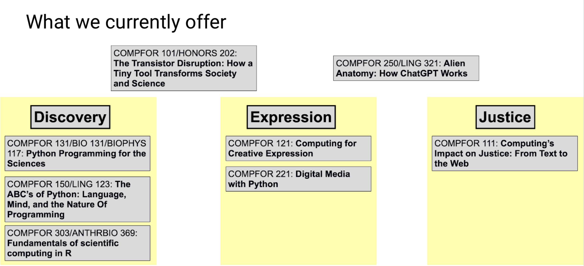
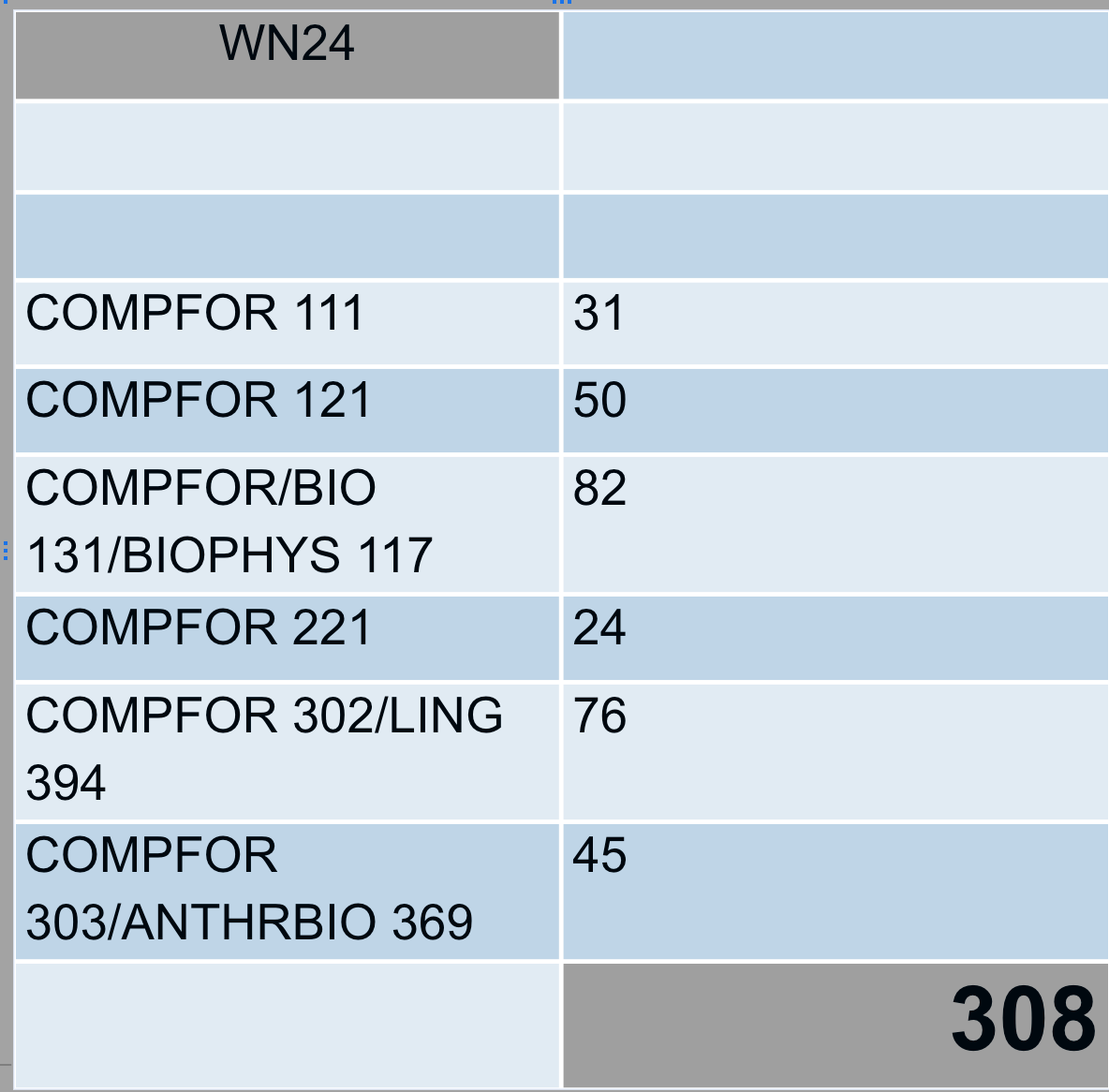
I’ve blogged about our first two courses, COMPFOR (COMPuting FOR) 111 “Computing’s Impact on Justice: From Text to the Web” and COMPFOR 121 “Computing for Creative Expression.” Now, we’re up to eight courses (see all the courses described here). As I mentioned at the start of PCAS, we think about computing in LSA in three themes: Computing for Discovery, Expression, and Justice. Several of these courses are collaborations with other departments, like our Discovery classes with Physics, Biophysics, Ecology and Evolutionary Biology, and Linguistics.
This semester, I’m teaching two brand new courses. That means that I’m creating them just ahead of the students. I did this in Fall 2022 for our first two courses (see links to the course pages here with a description of our participatory design process), and I hope to never do this again. It’s quite a sprint to always be generating material, all semester long, for about a hundred students.
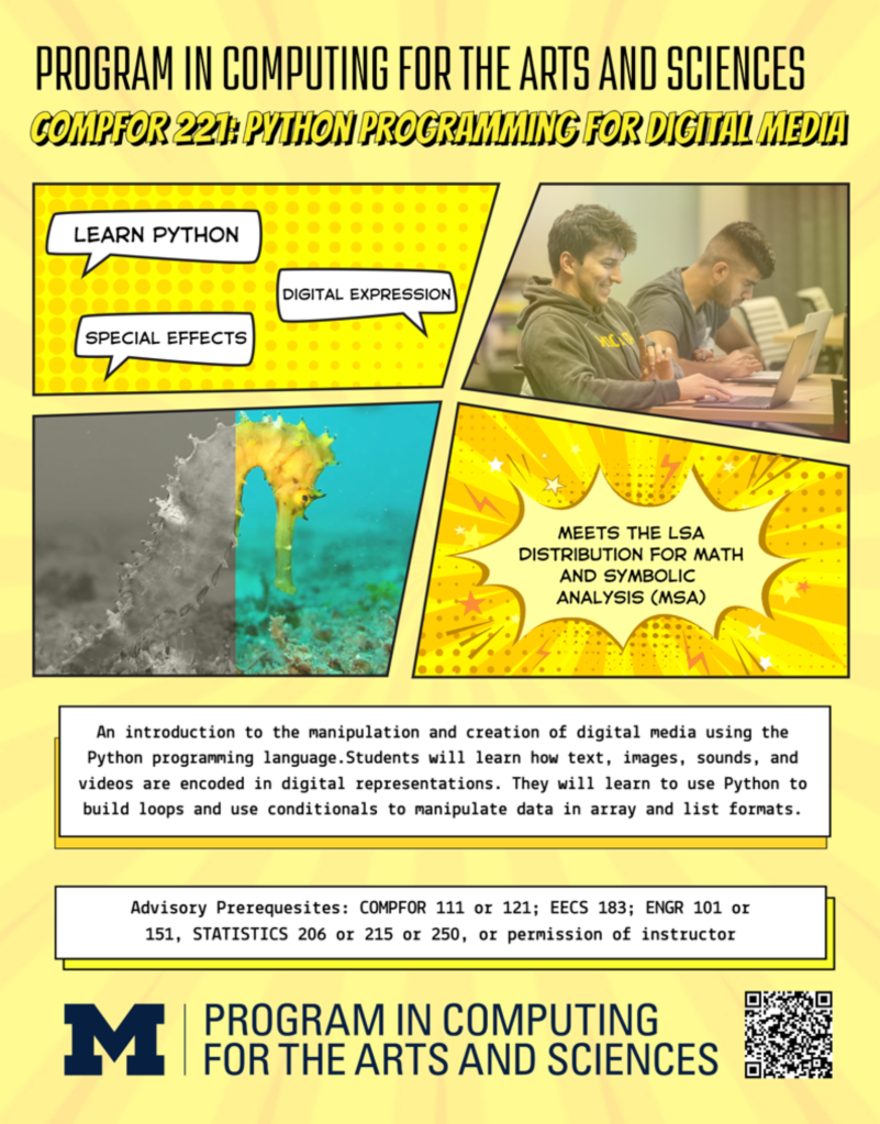
One course is like the Media Computation course I developed at Georgia Tech, but in Python 3: COMPFOR 221: Digital Media with Python. The course title has changed. When we first offered it, we called it “Python Programming for Digital Media,” and at the end of registration, we had only five students enrolled! We sent out some surveys and found that we’d mis-named it. Students read “Python Programming” and skipped the rest. The class filled once we changed our messaging to emphasize Digital Media first.
When we taught Media Computation at Georgia Tech, we used Jython and our purpose-built IDE, JES. Today, there’s jes4py that provides the JES media API in Python 3. I had no idea how hard it was to install libraries in Python 3 today! I’m grateful to Ben Shapiro at U-W who helped me figure out a bunch of fixes for different installation problems (see our multi-page installation guide).
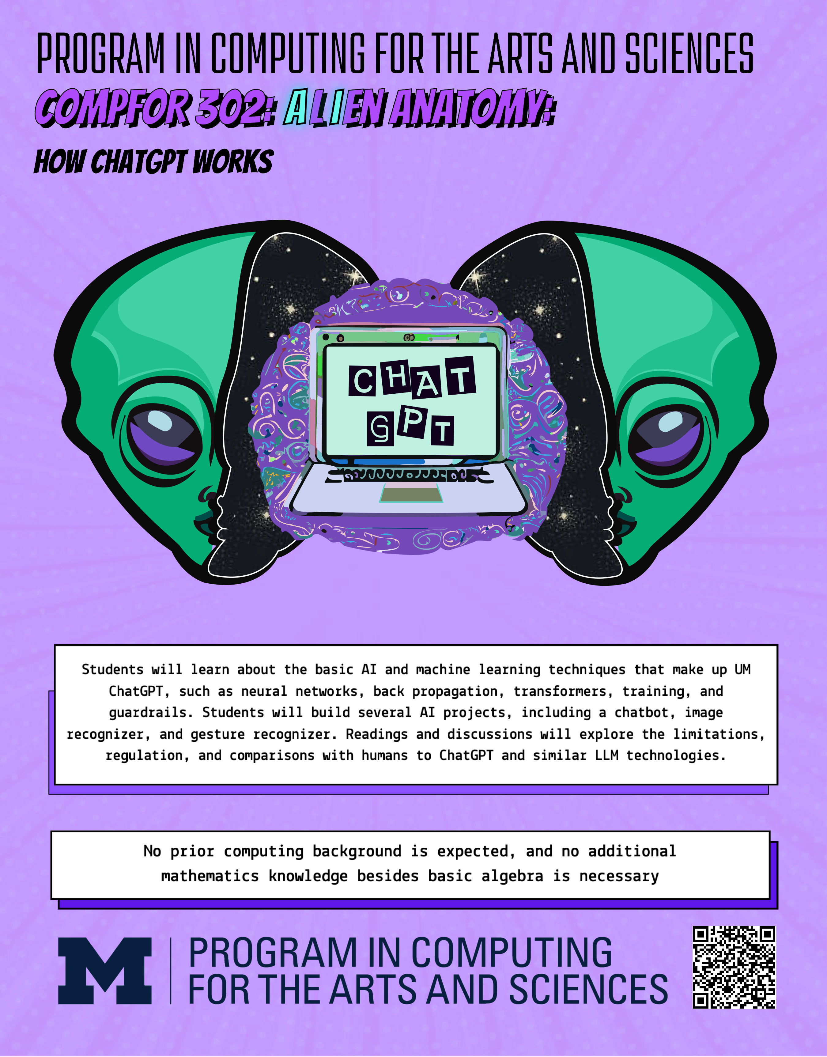
The second is more ambitious. It’s a course on Generative AI, with a particular focus on how it differs from human intelligence. We call it Alien Anatomy: How ChatGPT Works. It’s a special-topics course this semester, but in the future, it’ll be a 200-level (second year undergraduate) course with no pre-requisites open to all LSA students, so we’re relying on teaspoon languages and Snap! with a little Python. I’m team-teaching with Steve Abney, a computational linguist. Steve actually understands LLMs, and I knew very little. He’s been a patient teacher and a great partner on this. I’ve had to learn a lot, and we’re relying heavily on the great Generative AI Snap! projects that Jens Mönig has been creating, SciSnap from Eckart Modrow, and Ken Kahn’s blocks that provide an API to TensorFlow.
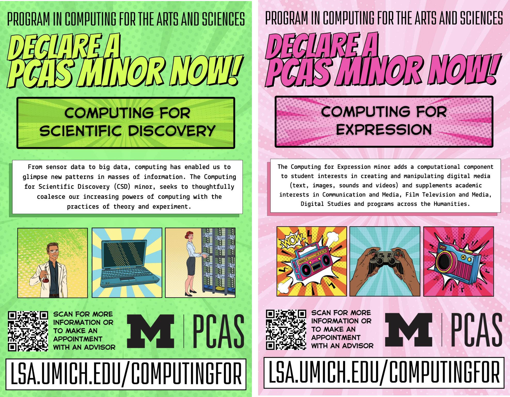
As of January, we are approved to offer two minors: Computing for Expression and Computing for Scientific Discovery. We have about a half dozen students enrolled so-far in the minors, which is pretty good for three months in.
PCAS Growth
When I offered the first two courses in Fall 2022, we had 11 students in Expression and 14 in Justice. Now, we’re up to 308 students enrolled. That’s probably our biggest challenge — managing growth and figuring out how to sustain it.
Research in PCAS
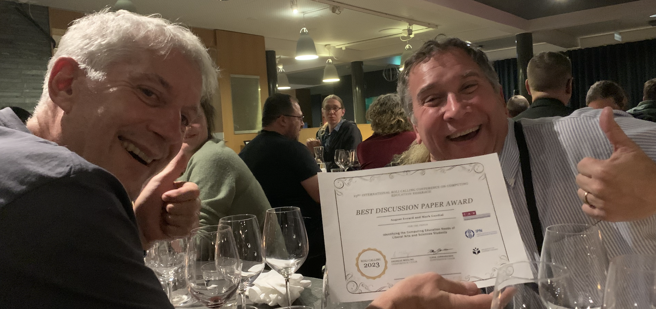
We’re starting to publish some of what we’re learning from PCAS. Last November, Gus Evrard and I published a paper at the Koli Calling International Conference on Computing Education Research about the process that we followed co-chairing the LSA Computing Education Task Force to figure out what LSA needed in computing education. That paper, Identifying the Computing Education Needs of Liberal Arts and Sciences Students, won a Best Discussion Paper Award. Here’s Gus and me at the conference banquet when we got our award.
Tamara Nelson-Fromm just presented a paper at the 2024 PLATEAU Workshop on evidence we have suggesting transfer of learning from teaspoon languages into our custom Snap! blocks. I’ll wait until those papers are released to tell you more about that.
SIGCSE 2024 Presentations
We’re pretty busy at SIGCSE 2024, and almost all of our presentations are connected to PCAS.
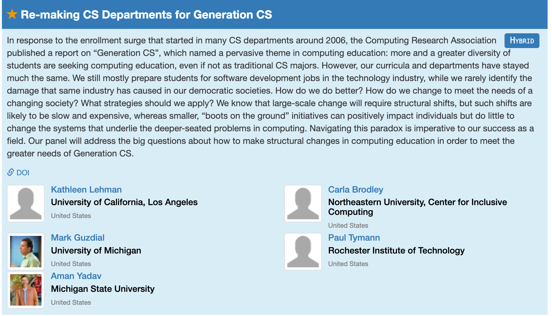
Thursday morning, I’m on a panel led by Kate Lehman on “Re-Making CS Departments for Generation CS” 10:45 – 12:00 at Oregon Ballroom 203. This is going to be a hardball panel. Yes, we’ll talk about radical change, but be warned that Aman and I are on the far end of the spectrum. Aman is going to talk about burning down the current CS departments to start over. I’m going to talk about giving up on traditional CS departments ever addressing the needs of Generation CS (because they’re too busy doing something else) and that we need more new programs like PCAS. I’m looking forward to hear all the panelists — it’ll be a fun session.
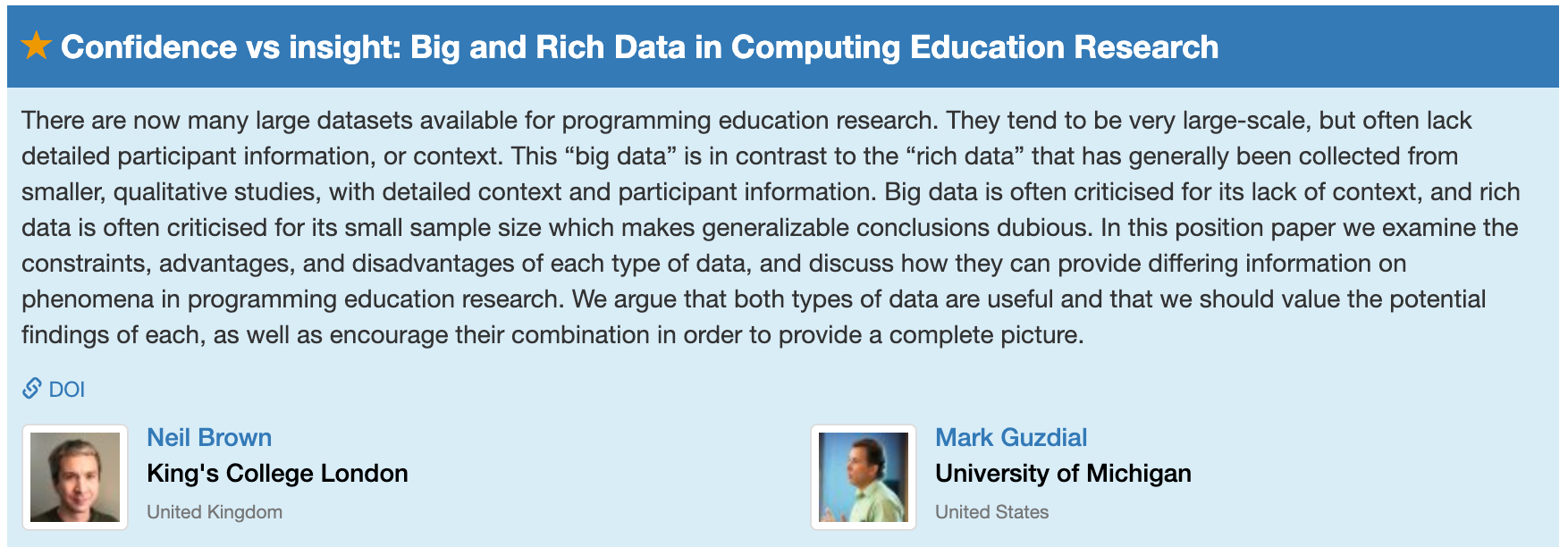
Thursday just after lunch, Neil Brown and I are presenting our paper, Confidence vs Insight: Big and Rich Data in Computing Education Research 13:45 – 14:10 at Meeting Room D135. It’s an unusual computing education research paper because we’re making an argument, not offering an empirical study. We’re both annoyed at SIGCSE reviewers who ask for contextual information (Who were these students? What programming assignments were they working on? What was their school like?) from big (millions of points) data, and then complaining about small sample sizes from rich data with interviews, personal connections, and contextual information. In the paper, we make an argument about what are reasonable questions to ask about each kind of data. In the presentation, the gloves come off, and we show actual reviews. (There are also costumes.)
We don’t really get into why SIGCSE reviewers evaluate papers with criteria that don’t match the data, but I have a hypothesis. SIGCSE reviewers are almost all CS teachers, and they read a paper asking, “Does this impact how I teach? Does it tell me what I need to do in my class? Does it convince me to change?” Those questions are too short-sighted. We need papers that answer those questions to help us with our current problems, but we also need to have knowledge for the next set of problems (like when we start teaching entirely new groups of students). The right question for evaluating a computing education research paper is, “Does this tell the computing education research community (not you the reviewer, personally, based on your experience) something we didn’t know that’s worth knowing, maybe in the future?”
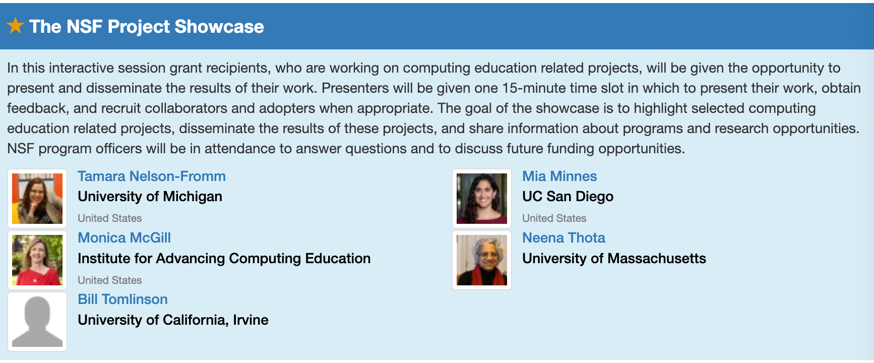
At the NSF Project Showcase Thursday 15:45 – 17:00 at Meeting Rooms E143-144, Tamara Nelson-Fromm is going to show where we are on our Discrete Mathematics project. She’ll demonstrate and share links to our ebooks for solving counting problems with Python and with one of our teaspoon languages, Counting Sheets.
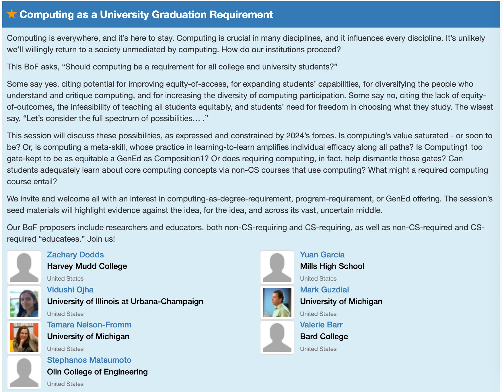
In the “second flock” of Birds of a Feather sessions Thursday 18:30 – 19:20 at Meeting Room D136, we’re going to be a part of Zach Dodd’s group on “Computing as a University Graduation Requirement”. There’s a real movement towards building out computing courses for everyone, not just CS majors, as we’re doing in PCAS. Zach is pushing further, for a general education requirement. I’m excited for the session to hear what everyone is doing.
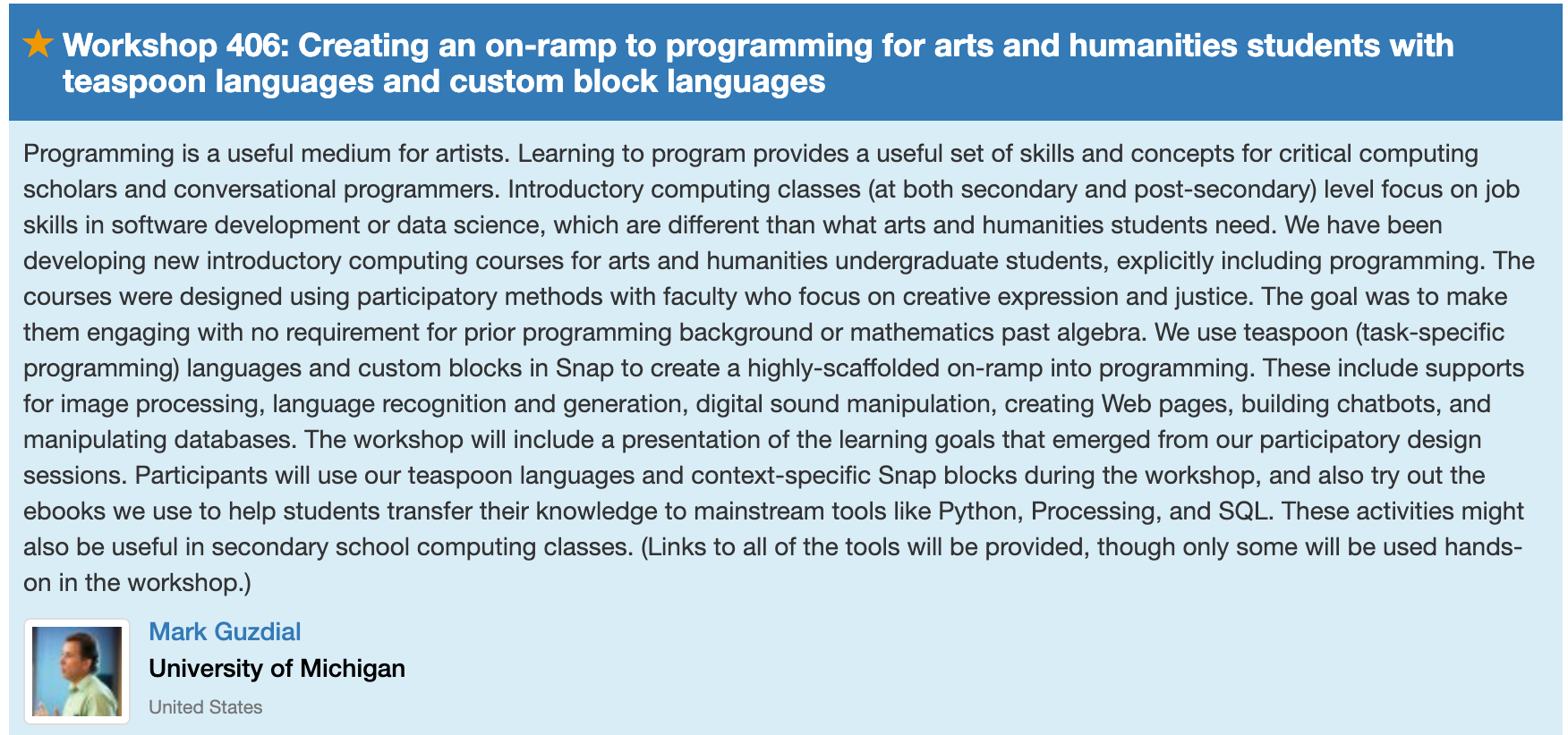
On Saturday afternoon 15:30 – 18:30 at Meeting Rooms B113, I’ll offer a three-hour workshop on how we teach in our PCAS courses for arts and humanities students, with teaspoon languages, custom Snap! blocks, and ebooks. Brian Miller has been teaching these courses this year, and he’s kindly letting me share the materials he’s been developing — he’s made some great improvements over what I did. This workshop was inspired by a comment from Joshua Paley in response to our initial posts about how we’re teaching, where he asked if I’d do a SIGCSE workshop on how we’re teaching PCAS. Will do it on Saturday!
How to Write a Guzdial Chart: Defining a Proposal in One Table
In my School, we use a technique for representing an entire research proposal in a single table. I started asking students to build these logic models when I got to Georgia Tech in the 1990’s. In Georgia Tech’s Human-Centered Computing PhD program, they have become pretty common. People talk about building “Guzdial Charts.” I thought that was cute — a local cultural practice that got my name on it.
Then someone pointed out to me that our HCC graduates have been carrying the practice with them. Amy Voida (now at U. Colorado-Boulder) has been requiring them in her research classes (see syllabus here and here). Sarita Yardi (U. Michigan) has written up a guide for her students on how to summarize a proposal in a single table. Guzdial Charts are a kind of “thing” now, at least in some human-centered computing schools.
Here, I explain what a Guzdial Chart is, where it came from, and why it should really be a Blumenfeld Chart [*].
Phyllis Teaches Elliot Logic Models
In 1990, I was in Elliot Soloway’s office at the University of Michigan as he was trying to explain an NSF proposal he was planning with School of Education professor, Phyllis Blumenfeld. (When I mention Phyllis’s name to CS folks, they usually ask “who?” When I mention her name to Education folks, they almost always know her — maybe for her work in defining project-based learning or maybe her work in instructional planning or maybe her work in engagement. She’s retired now, but is still a Big Name in Education.) Phyllis kept asking questions. “How many students in that study?” and “How are you going to measure that?” She finally got exasperated.
She went to the whiteboard and said, “Draw me a table like this.” Each row of the table is one study in the overall project.
- Leftmost column: What are you trying to achieve? What’s the research question?
- Next column: What data are you going to collect? What measures are you going to use (e.g., survey, log file, GPS location)?
- Next column: How much data are you going to collect? How many participants? How often are you going to use these measures with these participants (e.g., pre/post? Midterm? After a week delay?)?
- Next column: How are you going to analyze these data?
- Rightmost column: What do you expect to find? What’s your hypothesis for what’s going to happen?
This is a kind of a logic model, and you can find guides on how to build logic models. Logic models are used by program evaluators to describe how resources and activities will lead to desired impacts. This is a variation that Phyllis made us use in all of our proposals at UMich. (Maybe she invented it?) This version focused on the research being proposed. Each study reads on a row from left-to-right,
- from why you were doing it,
- to what you were doing,
- to what you expected to find.
When I got to Georgia Tech, I made one for every proposal I wrote. I made my students do them for their proposals, too. Somewhere along the way, lots of people started doing them. I think Beth Mynatt first called them “Guzdial Charts,” and despite my story about Phyllis Blumenfeld’s invention, the name stuck. People at Georgia Tech don’t know Phyllis, but they did know Guzdial.
Variations on a Guzdial Chart Theme
The critical part of a Guzdial Chart is that each study is one row, and includes purpose, methods, and expected outcome. There are lots of variations. Here’s an example of one that Jason Freeman (in our School of Music) wrote up for a proposal he was doing on EarSketch. He doesn’t list hypotheses, but it still describes purpose and methods, one row per study.

In Sarita’s variation, she has the students put the Expected Publication in the rightmost column. I like that — very concrete. If you’re in a discipline with some clearly defined publication targets, with a clear distinction between them (e.g. , the HCI community where Designing Interactive Systems (DIS) is often about process, and User Interface Software and Technology (UIST) is about UI technologies), then the publication targets are concrete and definable.
My former student, Mike Hewner, did one of the most qualitative dissertations of any of my students. He used a Guzdial Chart, but modified it for his study. Still one row per study, still including research question, hypothesis, analysis, and sampling.

I still use Guzdial Charts, and so do my students. For example, we used one to work through the story for a paper. Here’s one that we started on a whiteboard outside of my office, and we left it there for several weeks, filling in the cells as they made sense to us.

A Guzdial Chart is a handy way of summarizing a research project and making sure that it makes sense (or to use when making sense), row-by-row, left-to-right.
___________
[*] Because Ulysses now makes it super-easy to post to blogs, and I do most of my writing in Ulysses, I accidentally posted this post to Medium — my first ever Medium post. I wanted this to appear in my WordPress blog, also, so I decided to two blog posts: The Medium one on Blumenfeld Charts, and this one on Guzdial Charts.
Human-Centric Development of Software Tools: Dagstuhl Seminar Report now published
I wrote about this seminar when I attended (see post here) — the report has now been posted. I grimace a bit in sharing this since the title of my paragraph has a mis-spelling in it…Sigh.
Over two and half days, over 30 participants engaged in inventing and evaluating programming and software engineering tools from a human rather than tool perspective. We discussed methods, theories, recruitment, research questions, and community issues such as methods training and reviewing. This report is a summary of the key insights generated in the workshop.
Source: DROPS – Human-Centric Development of Software Tools (Dagstuhl Seminar 15222)

Recent Comments