How to Write a Guzdial Chart: Defining a Proposal in One Table
October 3, 2016 at 7:05 am 2 comments
In my School, we use a technique for representing an entire research proposal in a single table. I started asking students to build these logic models when I got to Georgia Tech in the 1990’s. In Georgia Tech’s Human-Centered Computing PhD program, they have become pretty common. People talk about building “Guzdial Charts.” I thought that was cute — a local cultural practice that got my name on it.
Then someone pointed out to me that our HCC graduates have been carrying the practice with them. Amy Voida (now at U. Colorado-Boulder) has been requiring them in her research classes (see syllabus here and here). Sarita Yardi (U. Michigan) has written up a guide for her students on how to summarize a proposal in a single table. Guzdial Charts are a kind of “thing” now, at least in some human-centered computing schools.
Here, I explain what a Guzdial Chart is, where it came from, and why it should really be a Blumenfeld Chart [*].
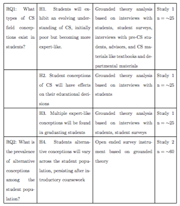
Phyllis Teaches Elliot Logic Models
In 1990, I was in Elliot Soloway’s office at the University of Michigan as he was trying to explain an NSF proposal he was planning with School of Education professor, Phyllis Blumenfeld. (When I mention Phyllis’s name to CS folks, they usually ask “who?” When I mention her name to Education folks, they almost always know her — maybe for her work in defining project-based learning or maybe her work in instructional planning or maybe her work in engagement. She’s retired now, but is still a Big Name in Education.) Phyllis kept asking questions. “How many students in that study?” and “How are you going to measure that?” She finally got exasperated.
She went to the whiteboard and said, “Draw me a table like this.” Each row of the table is one study in the overall project.
- Leftmost column: What are you trying to achieve? What’s the research question?
- Next column: What data are you going to collect? What measures are you going to use (e.g., survey, log file, GPS location)?
- Next column: How much data are you going to collect? How many participants? How often are you going to use these measures with these participants (e.g., pre/post? Midterm? After a week delay?)?
- Next column: How are you going to analyze these data?
- Rightmost column: What do you expect to find? What’s your hypothesis for what’s going to happen?
This is a kind of a logic model, and you can find guides on how to build logic models. Logic models are used by program evaluators to describe how resources and activities will lead to desired impacts. This is a variation that Phyllis made us use in all of our proposals at UMich. (Maybe she invented it?) This version focused on the research being proposed. Each study reads on a row from left-to-right,
- from why you were doing it,
- to what you were doing,
- to what you expected to find.
When I got to Georgia Tech, I made one for every proposal I wrote. I made my students do them for their proposals, too. Somewhere along the way, lots of people started doing them. I think Beth Mynatt first called them “Guzdial Charts,” and despite my story about Phyllis Blumenfeld’s invention, the name stuck. People at Georgia Tech don’t know Phyllis, but they did know Guzdial.
Variations on a Guzdial Chart Theme
The critical part of a Guzdial Chart is that each study is one row, and includes purpose, methods, and expected outcome. There are lots of variations. Here’s an example of one that Jason Freeman (in our School of Music) wrote up for a proposal he was doing on EarSketch. He doesn’t list hypotheses, but it still describes purpose and methods, one row per study.

In Sarita’s variation, she has the students put the Expected Publication in the rightmost column. I like that — very concrete. If you’re in a discipline with some clearly defined publication targets, with a clear distinction between them (e.g. , the HCI community where Designing Interactive Systems (DIS) is often about process, and User Interface Software and Technology (UIST) is about UI technologies), then the publication targets are concrete and definable.
My former student, Mike Hewner, did one of the most qualitative dissertations of any of my students. He used a Guzdial Chart, but modified it for his study. Still one row per study, still including research question, hypothesis, analysis, and sampling.
I still use Guzdial Charts, and so do my students. For example, we used one to work through the story for a paper. Here’s one that we started on a whiteboard outside of my office, and we left it there for several weeks, filling in the cells as they made sense to us.

A Guzdial Chart is a handy way of summarizing a research project and making sure that it makes sense (or to use when making sense), row-by-row, left-to-right.
___________
[*] Because Ulysses now makes it super-easy to post to blogs, and I do most of my writing in Ulysses, I accidentally posted this post to Medium — my first ever Medium post. I wanted this to appear in my WordPress blog, also, so I decided to two blog posts: The Medium one on Blumenfeld Charts, and this one on Guzdial Charts.
Entry filed under: Uncategorized. Tags: computing education research, educational psychology, educational technology, human-centered computing.
2 Comments Add your own
Leave a comment
Trackback this post | Subscribe to the comments via RSS Feed

1. Mike Lee | October 3, 2016 at 12:25 pm
Thank you for this informative post, Mark. I’ve shared it with my students and will be using it myself!
2. How to Write a Guzdial Chart: Defining a Proposal in One Table — Computing Education Blog | Site Title Adventures in Learning k-12 Inc. | October 3, 2016 at 4:00 pm
[…] via How to Write a Guzdial Chart: Defining a Proposal in One Table — Computing Education Blog […]